Every project starts with questions, not assumptions. We spend time understanding the business, the product, and the people who use it — before touching a single wireframe.
This means looking at the industry, the competition, and the users' actual behaviour. What problem does the product solve? Who has this problem, and how badly? Where does the current experience break down?
The goal of research is not to confirm what we already think. It's to find the things we don't know yet.
Methods: User interviews, stakeholder sessions, competitor analysis, user observation, moodboards.
Research produces information. This phase turns it into direction. We synthesise what we've learned and define what the product needs to do, for whom, and why — before deciding how.
A clear product definition at this stage prevents the kind of expensive rework that happens when assumptions go unchallenged until late in the build.
Methods: User personas, experience mapping, empathy maps, user stories, surveys.
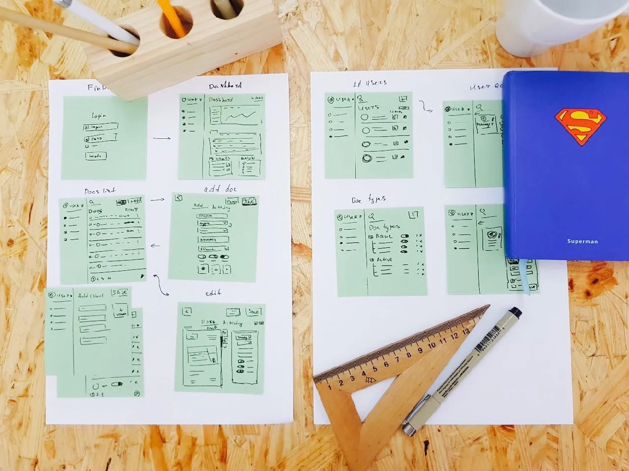
With a defined problem and a clear user in mind, we begin generating solutions. This is not decoration — it's problem solving through design. We explore multiple directions before committing to one.
Moodboards help calibrate the feeling of the product. System maps clarify structure. Wireframes and sketches test ideas quickly, before any significant time is invested.
Methods: Brainstorming, sketching, wireframing, moodboards, system maps, mockups.
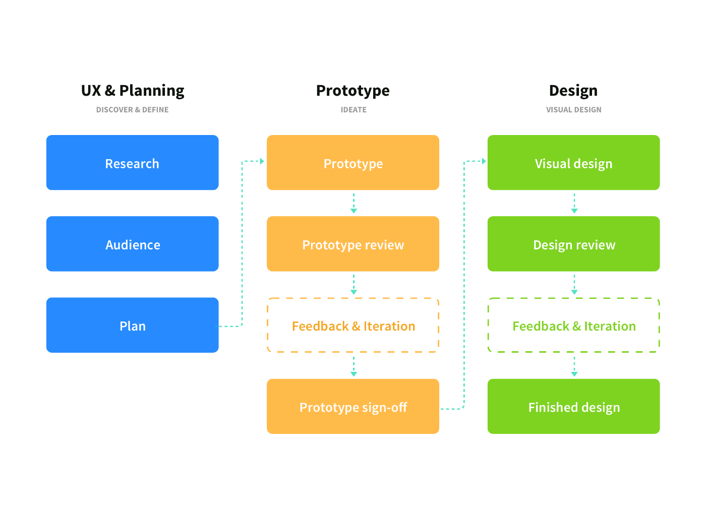
A prototype is not a finished product — it's a question made tangible. We build interactive prototypes to test specific assumptions with real users before development begins.
The purpose of a prototype is to learn, not to impress. A good prototype fails fast and cheaply, so the real product doesn't have to.
Tools: Figma, Framer, Principle, Marvel, InVision.
We put prototypes in front of real users and watch what happens. Not to validate our design choices — to challenge them. User testing surfaces problems that no amount of internal review will catch.
Testing also creates a feedback loop that continues after launch. A product that isn't measured isn't improving.
Methods: Moderated user testing, A/B testing, usability metrics, surveys, focus groups.
Once the structure is validated, we build the final visual layer — the aesthetic decisions that shape how the product feels to use. This is where brand, typography, colour, and motion come together with the UX foundation established earlier.
Visual design is not applied on top of UX. It's the last stage of the same process — and it only works well when everything underneath it is solid.
Tools: Figma, Sketch, InVision, Principle.
This isn't a waterfall. In practice, these phases overlap, loop back, and compress depending on the project. What stays consistent is the underlying logic: understand before you define, define before you design, design before you build.
The goal is always the same — a product that works for the people who use it.
 Published in Prototypr