A visual identity presented through a clear mark, a calm visual direction and real brand applications.
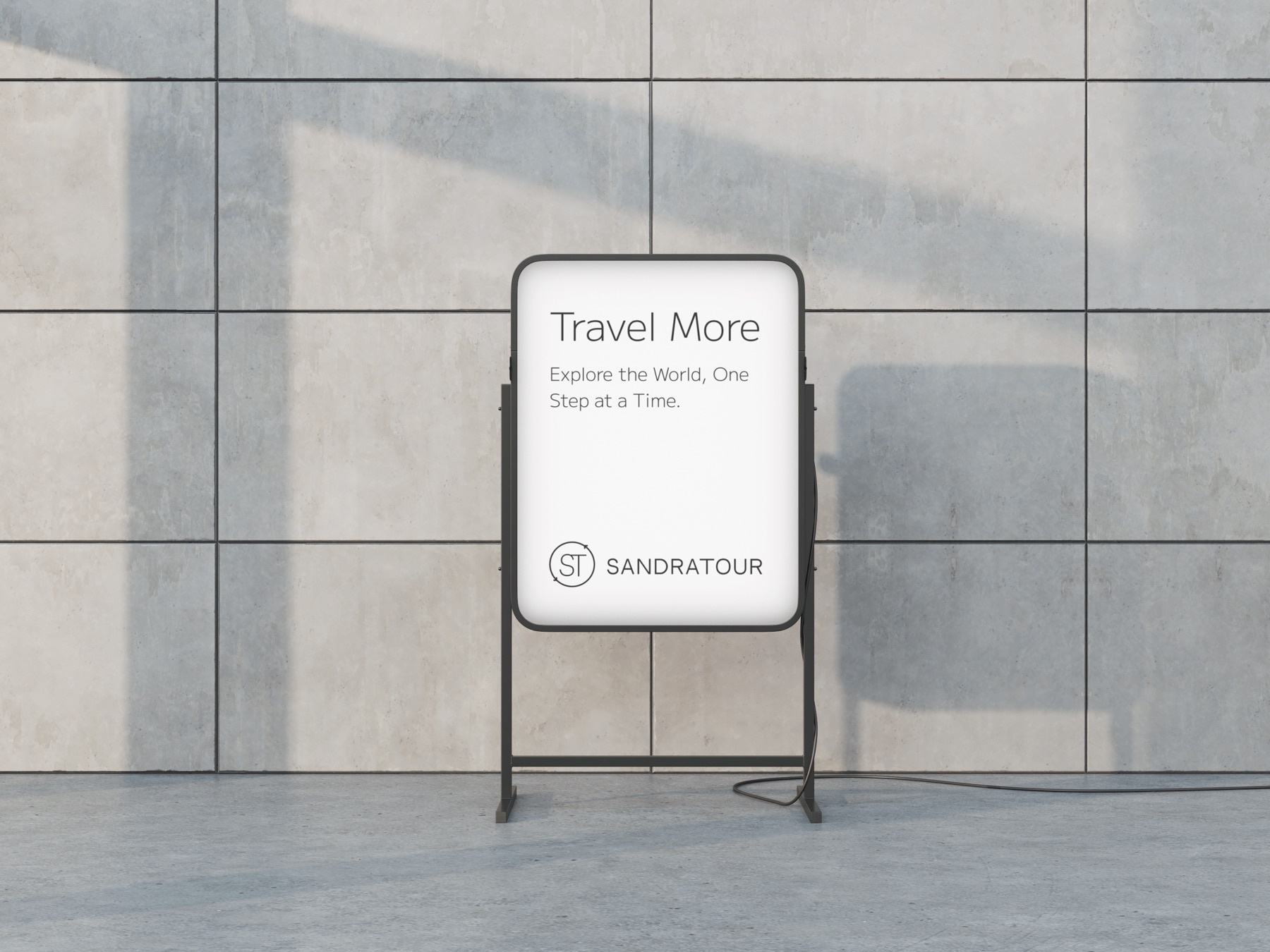
The Sandra Tour materials show a restrained identity built around a clear wordmark, a compact monogram and a calm, editorial visual language.
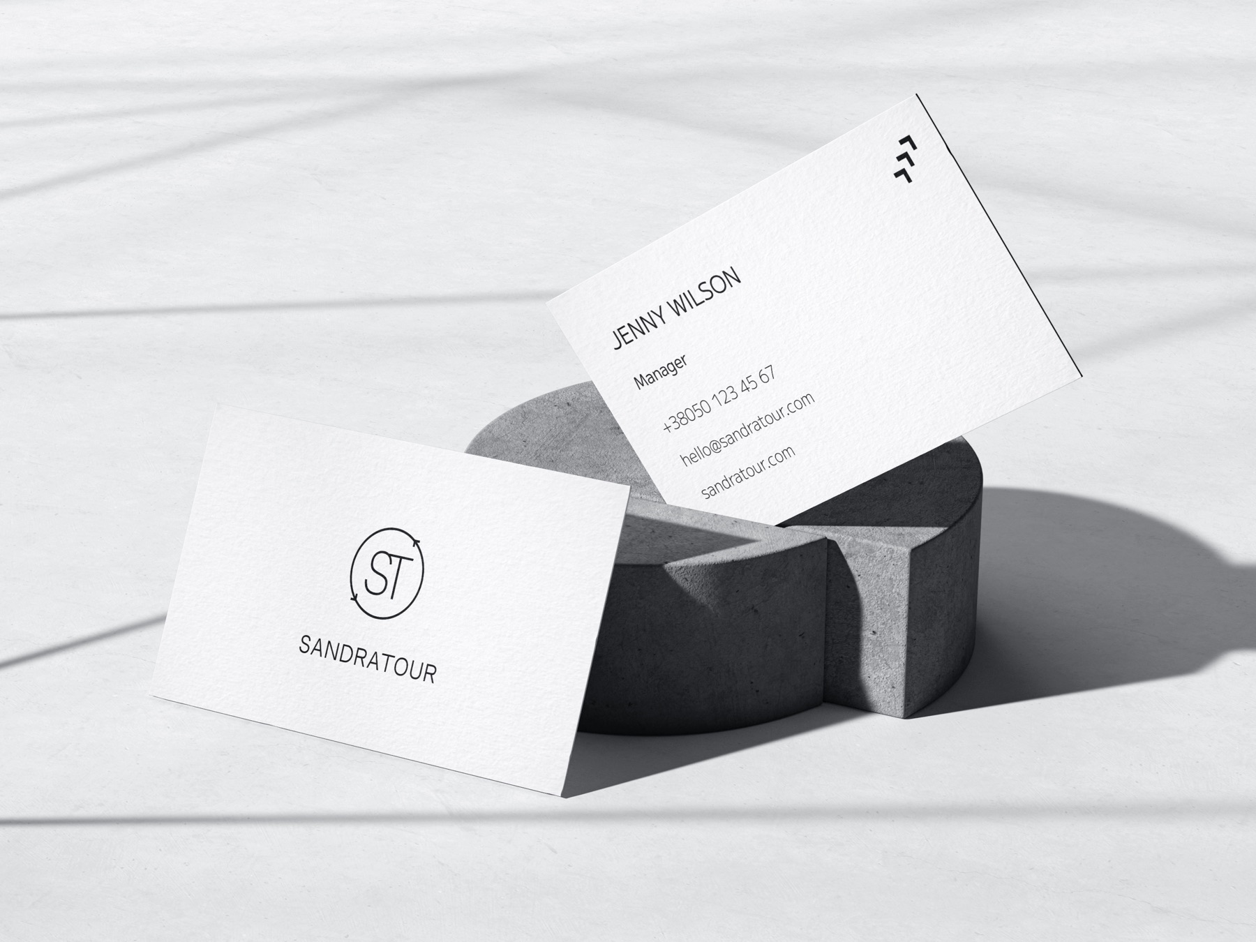
The available project materials show the identity across a sign, printed cards and a branded cup — physical touchpoints that make the system tangible.
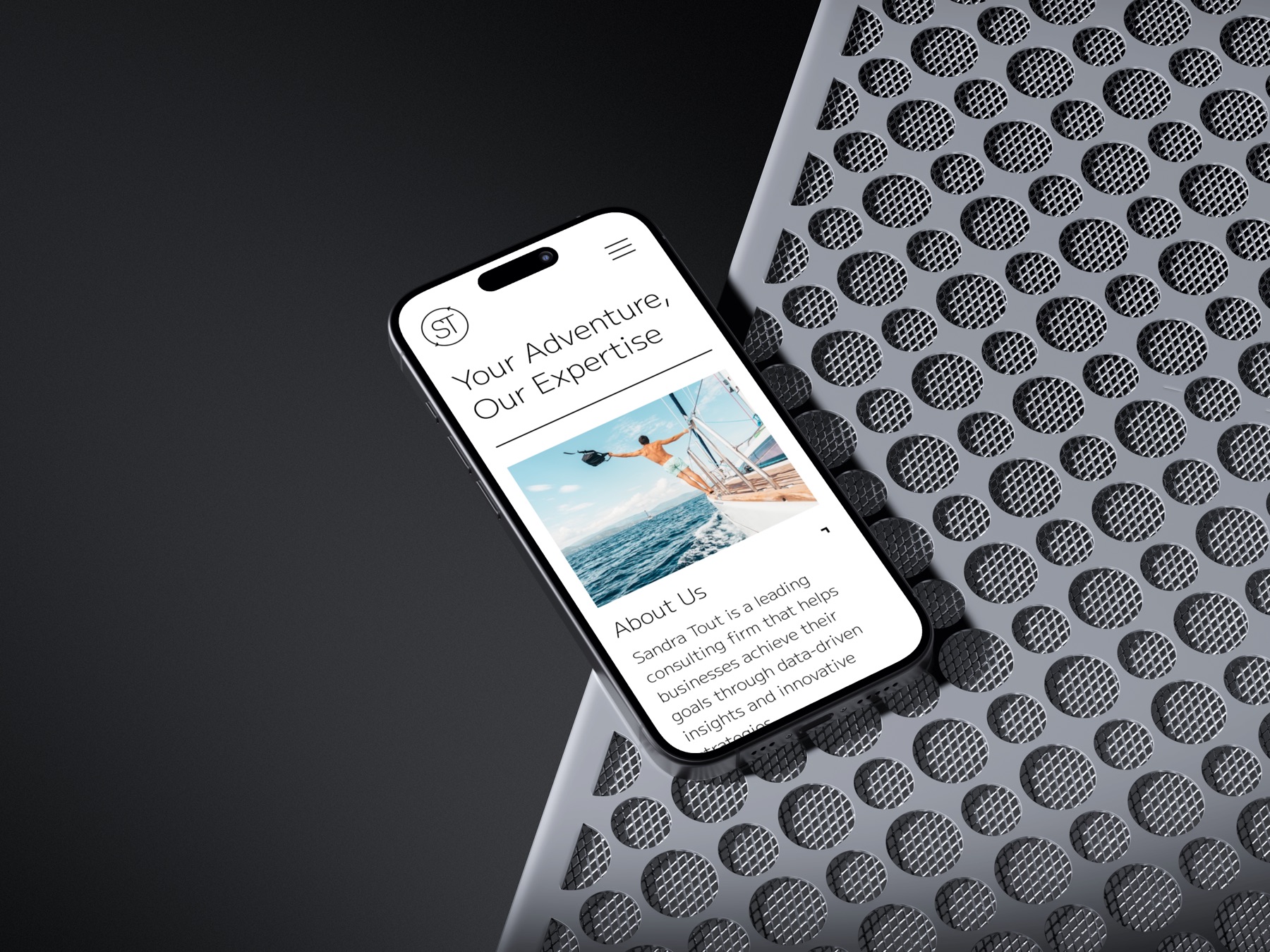
A mobile presentation extends the same visual direction into a digital context, keeping the identity recognisable beyond print and signage.
